As we’ve covered in our recent blog posts, notifications are big-deal in iOS 12. We’ve already got a chance to dig deeper while updating notifications in our clients’ apps, and it turns out there’s a ton of behind-the-scenes improvements. We are happy to share the findings with you.
But before we plunge right in, can we please stop for a moment and ask: why update notifications at all?
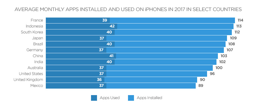
Source: AppAnnie
App Annie’s consumer app usage report shows that an average user has 100 apps installed and uses around 40 apps on a daily basis. What about the rest 60 apps — random check-ins once in a while? According to Apple, users are increasingly interacting with apps via notifications. So you better make each notification count. Luckily, iOS 12 has a lot to offer.
Quiet Notifications
Your only option to send notifications in previous iOS versions was a system dialog with custom text asking users if they would allow your app to send notifications. With iOS 12, Apple has given you a new variant to send notifications without asking for explicit permission from the user.
Such “quiet” notifications will go straight to the Notification Center, meaning they will not appear on the lock screen. Your benefit is obvious: you can start sending notifications right after your users install the app. Another advantage is that your users will actually get to see your notifications and will have enough context to decide if they need them or not.
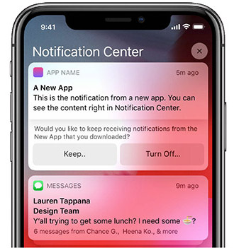
This functionality may become an ideal use case for most apps sending status updates or too many notifications for users to manage manually from the lock screen — news apps or similar.
In the Notification Center, users still get an option to confirm receiving your notifications going forward, or they can turn them off.
Best Practices:
- Provide enough info to users about your notifications and why they need them;
- Give users a chance to play with your app before asking for permission to deliver notifications;
- Make each notification valuable, not an empty invitation to your app.
Grouped Notifications
By default, all notifications in iOS 12 will be grouped by app. So if you don’t apply the new APIs for notifications, the system will start stacking your app’s notifications under a single notification platter. However, if you do decide to update your app — you can get, in Apple’s own terms, notification threads (and some other goodies).
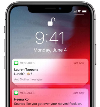
Threaded Notifications
Apple’s own Messages app is a good example of notification threads implementation. The app arranges notifications into grouped threads organized by contacts. This way the user gets one group of notifications for a chat with a colleague and a separate group for a conversation with a friend, etc.
The same mechanics can be applied to your app as well. Advanced users will still have an option to override these threaded notifications from settings and make your app’s notifications go into a single notification platter.
However, until your users have discovered this intricate and not very handy option, you can have your, let’s say pizza delivery app, group notifications into separate delivery updates and promotions threads.
Apple noted that threads don’t have to be groups of notifications though. You can also use threading in your notifications to separate status updates from actionable alerts. In this case, your user will have a stack of notifications that carry status updates, etc. and another notification, displayed separately, e.g., a reminder to take out the trash now.
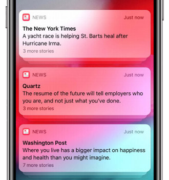
Summary in Notifications Card
One other interesting feature in grouped notifications is the summary, displayed under the most recent notification. By default, it tells the user the number of notifications in the group. However, you can set a custom summary and provide your users with more reasons to look through your notifications.
Your custom summary may show the count of delivered notifications and some details about their content. It appears the summary length is limited to two lines.
A nice little bonus from Apple is that by supporting a corresponding API, your app will automatically support correct localization of summary for different languages. iOS will automatically manage correct spelling of phrases like “1 more message” and “2 more messages”, as well as their variants in different other languages.
Rich Notifications in Groups
Apple provided a vivid example at one of its sessions for the developers where all grouped notifications from a Messages thread appear in the interactive preview once the user initiates a 3D Touch. The user gets a preview of the chat view with all messages that piled up in this stack of notifications. As a result, these messages get marked as read automatically.
What does it mean for you? Well, if you own a messaging app, you just got the best practice to handle your app’s notifications from Apple. If your app sends other types of notifications, remember that you can group rich notifications — those with interactivity and a rich preview — just like regular notifications.
Best Practices:
- Create threads to separate meaningful sets of notifications or single out actionable alerts;
- Customize the summaries for your notifications to make them more engaging.
Notification Actions
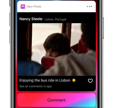
Last year Apple made notifications more interactive by letting mobile developers add custom actions like thumb up a photo with an action button. Though actions and rich content were a huge leap forward for notifications, the action buttons themselves remained static.
With iOS 12, you will now be able to change action buttons, so that if a user, let’s say, likes a photo in a notification preview, the button “Like” switches to “Dislike” and the user can now take his like back. Alternatively, you can make the action buttons go away once the user has interacted with them.
Best Practices:
- Add interactivity to action buttons;
- Alternatively, replace action buttons with interactive UI in the notification view.
Interactive Content in Notifications
So as we mentioned before, in iOS 12 you can enable dynamic, interactive experience within notifications for your users. What that means is that you can send notifications with:
- Images,
- Videos,
- Audio,
and users can engage with this content, e.g., play music right within the notification, etc.
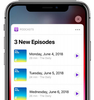
As an example, you can replace a “Like” action button with a heart icon and allow users to tap it to like or dislike a photo in your notification, or you can play a podcast episode from a podcasting app’s notification. Yeah, it’s pretty exciting and has got a round of applause at the corresponding WWDC session.
Let’s say you have a task management app with reminders. With the interactivity, you can let your users mark a task as completed right within a notification.
This new ability to engage users via interactive content also lets you provide users with new ways to enter your app. Or with a way to dismiss a notification after the user has interacted with it.
Best Practices:
- Let users interact with your notification contents right inside the notification;
- Think about landing screens for users based on where they tap in the notification;
- Remember that a user interaction can be a trigger to dismiss a notification.
iOS 12 Notifications Settings Integration
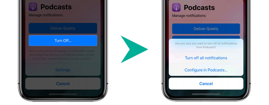
In iOS 12 there is just a single tap between the iOS notification settings for your app and a custom notification settings dialog inside your app. A good rule of thumb is a custom in-app notifications settings screen that allows granular control over all app’s notification.
So if your app is sending a lot of notifications for various events, it becomes critical to let users choose what exactly they want to follow.
Because if users get everything in bulk, e.g., critical status updates and promotions — and they cannot toggle between these types of notifications inside your app — the chances are, your notifications will be turned off altogether.
Users can also turn off any notification completely from the lock screen. It’s only Apple’s grace that before this happens, users are presented with an option to go straight to your app’s custom notification settings and try and fine tune rather than shut down your app’s notifications altogether.
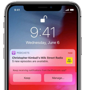
Apple went as far as letting you decide what notification settings view in your app to show to the user, depending on whether she or he is coming from the system notifications dialog, or from a notification.
The company insists that once users decide to go to your app to manage its notifications settings, it’s critical to take them directly to your custom notifications settings. So trying to squeeze in another banner with explanations on why your notifications must be on is probably not the best idea. Such things should blend naturally somewhere in your app settings.
Best Practices:
- Implement custom in-app experience for notifications management;
- Let users subscribe to different types of notification individually;
- Track where users come from and take them to the most relevant screen.
The King of Notifications: Critical Alert
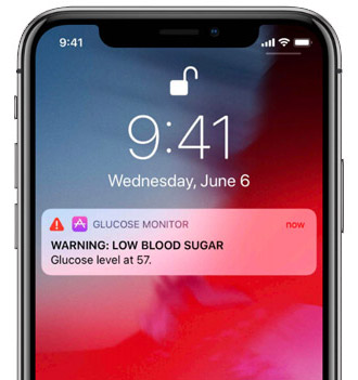
With iOS 12 Apple is introducing a brand-new type of notifications that will work only for some app, and you would need to apply for the entitlement. The company calls such notifications “critical alerts” and says they will work for: medical and health apps, home and security apps, and public safety apps.
Mobile developers will be required to ask for user permission to send them critical alerts because they are very disruptive. Alerts bypass the “Do Not Disturb” mode, get delivered locally or from a server (as a push notification), and always play a sound. BTW, you can set the volume and assign a custom tone for the latter.
So if your app deals with the user’s health or security, and you might deliver urgent notifications that require an immediate action from the user — go here and apply with Apple.
Apple Watch Notifications
At the Apple Watch notifications session, Apple’s Heena Ko boldly stated that notifications are the primary way for users to interact with apps on the Apple Watch. Needless to say, you should make every effort to make your notifications for the Apple Watch as engaging as they are on the iPhone.
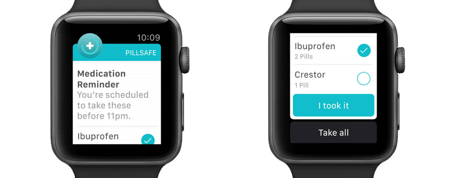
iOS coordinates alerts and sends them to the most accessible device. So if a phone is locked and the user is wearing an Apple Watch, a notification may go directly to Apple Watch. You want to make sure this notification looks well on both devices.
Mobile developers working on Apple Watch notifications can:
- Change colors,
- Add images and icons,
- Add an inline video.
When working on notifications for Apple Watch, keep in mind that the device also supports interactive and group notifications. An exemplary use case is a ride-hailing app DIDI that lets users rate a driver and pay for the ride — all from a notification.
Best Practices:
- Keep notifications Informative and succinct;
- Make them visually appealing by adding images, icons, and videos;
- Add quick interactions without recreating the app experience.
Provide Value to Users
Apple is continuing to apply AI technology to iOS at large: from Siri to notifications. And now it becomes even more crucial for mobile developers to make every notification count. If the iOS detects that users are not interacting with your app’s notifications on a regular basis, it will send them a prompt asking to confirm or turn off your notifications.
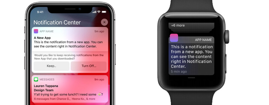
The panacea, again, is to make the content relevant to the user and always implement integration with the system notifications settings. This way you always get one last try to lure users to your in-app custom notifications view, where they can, hopefully, set notifications to their liking, on a more granular level.
Make Your Apps Ready for iOS 12
Get in touch, and we will provide a free-of-charge audit of your iOS app to choose the best strategy for optimizing its notifications. Our quote will include recommendations and actionable advice to make notifications in your app more engaging than ever.


